


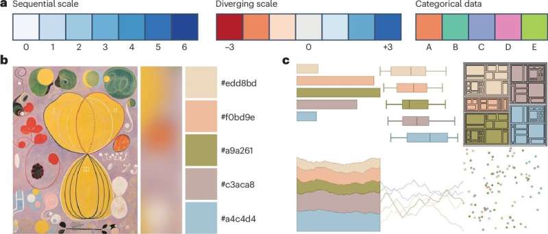
Every year, over one million scientific articles are published within the life sciences, with two-thirds incorporating statistical figures that often challenge even experienced scientists in terms of clarity and reproducibility. In response to this issue, Dr. Helena Jambor, a molecular biologist affiliated with the University of Applied Sciences of the Grisons and TU Dresden, has introduced a practical checklist designed to enhance the visualization of scientific data. This initiative, detailed in the journal Nature Cell Biology, aims to streamline the process of creating effective scientific figures.
Dr. Jambor explains, “Just like a checklist helps pilots ensure they don’t forget anything before takeoff, this checklist can provide scientists with quick guidance on how to present their data.” Her publication, “Checklist for designing and improving the visualization of scientific data,” serves as a user-friendly guide, offering recommendations on statistical chart selection, text design, color choice, layout, and directing viewer attention. “With this, I want to contribute to improving scientific communication,” Jambor states, highlighting her motivation.
Background and Development
For over a decade, Jambor has focused on the clarity, reliability, and reproducibility of scientific figures. Her journey began at the Max Planck Institute of Molecular Cell Biology and Genetics and continued at TU Dresden. During this period, standardized guidelines for publishing and reproducing figures were notably absent. “Visual aids help us make decisions every day,” Jambor emphasizes, “We navigate using road signs and communicate with emojis. Visual aids give patients a way to better understand their treatments, especially in difficult situations.”
Dr. Jambor’s checklist is not only a tool for scientists but also a bridge to improve communication between doctors and patients. In a study published in the Journal of the American Medical Informatics Association, she explored the use of visual aids to enhance patient comprehension of treatment plans, underscoring the broader impact of her work beyond academia.
Recognition and Impact
In November 2024, Dr. Jambor’s efforts were recognized with the Early Career Einstein Award for her project “PixelQuality—Best practices for publishing images,” a collaboration with Dr. Christopher Schmied from the Leibniz Institute for Molecular Pharmacology in Berlin. This accolade underscores the significance of her contributions to the field of scientific communication.
Jambor’s work highlights the critical role of effective visual aids in scientific research and healthcare. “Doctors can use them to integrate various data into their decision-making, and researchers can more easily grasp the impact of new treatments,” she notes. Conversely, poor visual aids can lead to misinterpretations, adversely affecting treatment processes and biomedical research outcomes.
Future Directions
The introduction of Jambor’s checklist marks a significant step forward in the realm of scientific communication. By providing a structured approach to data visualization, it equips researchers with the tools necessary to present their findings more clearly and effectively. As the scientific community continues to grapple with the challenges of data presentation, resources like Jambor’s checklist are poised to play an increasingly vital role.
Looking ahead, the broader adoption of such guidelines could enhance the reproducibility and transparency of scientific research, fostering greater collaboration and understanding across disciplines. As Jambor’s checklist gains traction, it may well become an essential component of the scientific toolkit, benefiting not only researchers but also healthcare professionals and patients alike.
For further details, refer to Helena Klara Jambor’s publication in Nature Cell Biology (2025). DOI: 10.1038/s41556-025-01684-z.